And so it was with great interest that I attended the LGM talk by Peter Sikking and Kamila Giedrojć entitled "OpenUsability - Project overview and first results from the OpenUsability GIMP redesign project."
The GIMP redesign project is a pilot project for an OpenUsability initiative that would have student projects selected and supported in a fashion not unlike Google's Summer of Code. Ms. Giedrojć was the student chosen for this trial run.
Mr. Sikking began the presentation with GIMP's product vision. According to an article by Jim Highsmith found here, "creating a product vision statement helps teams remain focused on the critical aspects of the product, even when details are changing rapidly." Clearly, knowing what GIMP is and is not, the redesign can focus on the features that truly matter.
So, according to the presentation and the project's wiki page, GIMP is:
- Free software
- Intended for photo manipulation
- A high-end application for icons, web pages, and art for user interface elements
- A platform for image processing algorithms
- User configurable such that tasks can be automated with little or no development skill required
- Easily user extendable with one-click installation of plug-ins
- Photoshop
- A painting program (such as Corel Painter)
- A web-page mock up program
- The only Linux based pixel-oriented application on the face of the planet
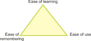
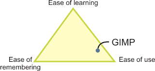
 Designers must choose where their software will lie in this triangle, remembering that trying to balance all three could be a dangerous idea.
Mr. Sikking tells us that GIMP aims to have the highest ease of use, and needs not worry as much about ease of remembering. Ease of learning should be of slightly higher concern than ease of remembering. My feeling on the reasoning behind this is that the software tends to be used often enough that the typical user won't have large gaps between sessions in which to forget everything.
 GIMP lies in the bottom right of our Three E's triangle. This can be compared to learning the violin: it is not an easy instrument to learn, but once it has been mastered, beautiful things can be created; however, the musician must keep practicing.
The next part of the presentation detailed the steps taken so far in GIMP's redesign. First, a summary of the software's current functionality was narrowed down to just eleven pages; this took two and a half months to complete. Then, with users observed in their workplace, eight user scenarios were developed, which can be found here. Finally, twenty-five expert evaluation sessions were conducted based on the user scenarios. Notes on this session can be found here. The analysis of the expert evaluation is currently in progress.
The final topic in the talk was a list of the top ten user requests and a brief analysis of each. This portion was mainly delivered by Ms. Giedrojć, and then (unnecessarily) summarized by Mr. Sikking. The key theme here was to use the product vision and user scenarios / expert evaluations to determine which features should be changed or added.
For example, request number nine was for the ability to paint with natural brushes. However, noting that the product vision states that GIMP is not a painting program, there is actually no real requirement for this. Users can write their own plug-ins as desired, but there is no need to consume developer effort on such a request.
As another example, improvements to the text tool was request number eight. Users into original art and web graphics were particularly adamant about this one. Analysis showed that there was no requirement for page layout in particular, and that there should not be one layer per every piece of text. Furthermore, better styling and typographical control is required.
This last example provides the perfect lead-in to my Summer of Code project which will be all about text tool improvements as well. In fact, my first task will be to redesign some of the text UI in Inkscape. The kind of analysis done for GIMP can definitely be applied, though with a smaller scale, to my own work. I'm particularly excited about this because I may finally have the chance to unleash this passion for usability.
It should be obvious by now that I quite enjoyed this talk. It was well organized and reinforced the ideas that I learned in school. I hope to keep an eye on the progress and check out the results, especially because the not-so-usable current version of GIMP never really earned my attention. We'll see if the redesign does any better.

1 comments:
Hey, I have that book "Design of Everyday things". Very good book.
Post a Comment
Comments are moderated - please be patient while I approve yours.
Note: Only a member of this blog may post a comment.